
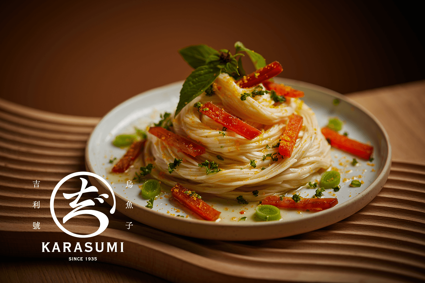
KARASUMI 吉利號烏魚子 / 品牌
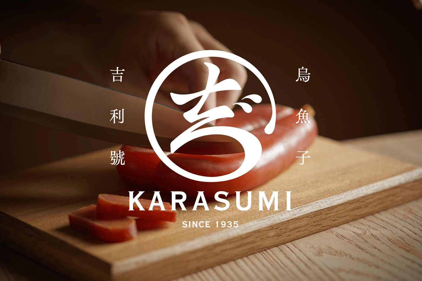
傳承四代的吉利號烏魚子此次的品牌重塑,以橘黃色為主調,營造出溫暖、自然的氛圍,象徵著夕陽下烏魚群的金光灑落海面。包裝分級的方式上精緻的圖案呈現烏魚子的生態,以細緻的線條勾勒出野生烏魚的身影,展現出傳統手藝的細緻工藝。品牌標誌以流暢的線條呈現「吉」字樣,簡約而不失莊重,凸顯品牌的歷史與尊貴。產品標籤上融入豐富的台灣元素,加上海浪元素,突顯烏魚子的原產地與傳統製作。整體視覺風格以傳統和現代的融合為特點,打破陳舊的形象,展現吉利號烏魚子作為當代美食的新風貌。這套視覺設計不僅呈現出產品的高品質,更突顯了品牌的文化底蘊和對於傳統工藝的珍愛。
In this rebranding of the four-generation legacy of Karasumi, the main color theme is orange, creating a warm and natural atmosphere that symbolizes the golden light of the sunset on the sea where the mullet fish gather. The packaging adopts an intricate design to showcase the ecology of Karasumi, using delicate lines to outline the silhouette of wild mullet fish and highlighting the meticulous craftsmanship of traditional techniques.
The brand logo presents the character "吉" (KARASU) in a fluid and simple manner, exuding a sense of history and nobility. The product labels incorporate rich Taiwanese elements, including the addition of sea wave motifs, emphasizing the origin of Karasumi and its traditional production methods. The overall visual style blends tradition and modernity, breaking away from outdated images and presenting Karasumi as a contemporary gourmet delicacy. This visual design not only reflects the high quality of the product but also emphasizes the brand's cultural heritage and reverence for traditional craftsmanship.
四代にわたる伝統のカラスミ、今回のブランドリニューアルでは、オレンジを主調にし、暖かく自然な雰囲気を醸し出すことで、夕陽が海面にまばゆい光を投げかける烏魚の群れの象徴となります。パッケージは、繊細なデザインでグレード分けされ、烏魚子の生態を精巧な線で描き出し、伝統的な手法の繊細な職人技を際立たせています。
ブランドのロゴは、「吉」の文字を流れるような線で表現し、歴史と格式を感じさせます。製品ラベルには豊かな台湾の要素が取り入れられ、海の波のモチーフが加えられ、烏魚子の原産地と伝統的な製法が強調されています。全体の視覚的スタイルは伝統と現代が融合した特徴を持ち、古くさいイメージを打破し、烏魚子を現代の美食として提示しています。この視覚的なデザインは製品の高品質を反映するだけでなく、ブランドの文化的な遺産と伝統的な職人技に対する尊敬を強調しています。


Branding 2023
Client|吉利號烏魚子
Creative Director|Wang Chia Ying
Art Director|Lin Chieh Hui
Designer|Wang Chia Ying,Liou Shih Hua
Photo| wu2


